Change how questions look on the device
|
Use Display Classes to guide device users to enter the correct information |
|||
|
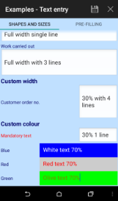
Most template items have an option to enter display classes. Display classes can also be set for a whole section and (usually) page and document. These are special words that change the colour, size and position of questions and answers on the device. |
|||
|
|||
| align |
|
||
| scale |
percentage value as a multiplier. In other wordsscale:50 would be half the normal size where as scale:200 would be double. |
||
| colour |
can be in the HEX format #RRGGBB or #AARRGGBB where
|
or named colours
|
|
| width | changes the size of the answer box using the same percentage system as scale. In other wordswidth:50 would be make the answer box half of the width of the device screen. Obviously, more than 100 will not work | ||
|
leftpc rightpc |
these work together to change the relative size of the question and answer box. It only works if the Section layout type is one of the 'same line' ones. The most common use is leftpc:1;rightpc:2, which makes the answer box twice the width of the question (in the usual section layout). | ||
| backcolour | uses the same values as colour but applies them to the background rather than the text | ||
| labcolour | uses the same values as colour but applies them to the label rather than the text | ||
|
padtop padbottom |
create more space between questions in pixels, for example padtop:10;padbottom:10 on all questions would put 20 pixels between them all. | ||
|
back |
bubble is the only value allowed here. This creates a lozenge shaped background for the text which is useful for highlighting information such as help text or additional instructions. It will always be the same pink colour (known as lobster bisque!). | ||
See Also


